|
Art Is Easy to Make! |
by Poochie Myers |
|
Sections: Art Gallery Art Gallery
Return to the Top of Page
Art Gallery
Return to the Top of Page
Art Gallery
Return to the Top of Page |
This is the fifth lesson of the Art Studies class by Poochie Myers. Poochie would like to start a dialogue with new students to art as well as professionals who might want to include segments into these art lessons, or field questions from participants. Please email your comments to Poochie: poochie@artistzone.org. If you have to struggle then you are doing something wrong.
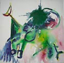
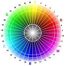
Lesson Five - Color, Consistency, ContinuityColorUsing color in your work is rewarding but can be very confusing and actually work against you. If you work a lot in black and white, the subtle changes in values are easy to determine. Changing to color fools you into thinking you have contrast when you don't. Also, with color you have to realize the compliments that make color appear to move in or out. Our optical illusions play a large part with color.
Kandinsky taught us that blue goes high
and light, no matter where it is placed. It is the nature of blue to do
this. Red, he said, settles down. And yellow is the only dynamic color. Yellow is the only color
that appears to move around. Red, Yellow and BlueRed, Yellow, and blue, the primary colors make every other color. The color wheel shows you the complimentary color of these primary colors - the color opposite red, yellow, and blue on the wheel. You can buy a color wheel or you can make one. Another way to discover the complimentary color is to place a primary color over white and under a bright light for the count of 10. Keep your eyes in the same place and quickly remove the primary color. As your eyes adjust you will see the complimentary color. How do you
make purple, green and orange? Look again at the wheel of color. You see
that blue is near purple and red is also near purple. Red and blue make
purple. There are many shades of purple depending on the amounts of red
or blue you mix together. The same goes for green, look at yellow and
blue, mix them together and you have green. A really fun green is made
from ivory black and yellow. This might make you wonder just how we got
black? Black comes from all the colors mixed together, but mostly lots
of blue. It is best to make your own black, instead of using ivory black
or lamp black from tubes. You can make black easily by mixing thalo blue
and alizerine crimson. Instant black. If you are glazing with alizerine
crimson over a blue area you will end up with black. ExperimentPut a little of your paints out on a large piece of glass or plastic pallet. Try mixing together each color with each other color. You will learn what color does and which colors you like the most. You can read and read but nothing takes the place of experience.When you compose using color, think about the blue going up, red down, and yellow moving. Would you want a red sky? Well you might but you know what will happen with a red sky - heavy, heavy. Blue sidewalks would be disconcerting. Just imagine how inviting the blue swimming pool is - like diving into infinity. Yellow jumps out at you, doesn't it? Yellow signs on the highway are very noticeable and since we are traveling, we don't notice the movement of yellow. A red stop sign does what it is supposed to do, stop you. Red is heavy. The first blocking out of color sets your design. So every bit of color on the canvas has to be thought out. What mood do you want to display? Red will not be good for a whimsical feeling. Blue is good for a light mood. Yellow is for movement. Perhaps turn on some music to establish your mood before you begin the painting. You need to execute a lot of exercise paintings in order to teach yourself new ideas. Perhaps take only a corner of the exercise piece to develop a painting. Use a matt to isolate the areas you like. If you are painting outside, be careful of the sunshine. Don't let the sun shine directly on your canvas. It is too bright to determine correct colors. And it could give you a terrible headache. Keep looking at your painting with squinted eyes. This gives distance and shows you the contrast of the colors. You could paint away and bring it inside to discover it was all one value. What does value mean? From light to dark. Just imagine mixing a color with white, the less white the darker the value. Some painters use this value to make their paintings flat. Some painters use value to make a huge space, distance in their paintings. It's important to understand value. Hue is different.
Hue means mixing different colors together. Look in a paint store for
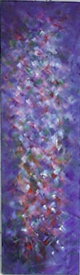
the different hues available in the color chip sections. Cold Colors and Warm ColorsColors on the blue side of the color wheel are cool. Just think of it, shadows are cool when you stand in them. The sun is hot - warm colors are on the side of the wheel that is red, orange and yellow. Who cares? You do. If you want a mood to be bright and cheerful then don't paint the canvas blue.Just paint a lot and you will soon understand hue. White is a good color to discover hues.....just put a little color in white. Now mix a touch of a different color into this color - a different hue. If you are working with acrylics you may be a little frustrated because they don't mix like oil paints mix. Oil paints are the most versatile of all the pigments. Acrylics mix very well but there are a few colors that just don't mix. Water colors mix easily. Close colors are just what they imply - they are close on the color wheel. Using these close colors can give you a glowing effect. The sunset is usually made of close colors, notice how it glows. This is called an analogous color scheme. Local color
is the color of the object. These are
all conditioned by: the color of the light - dawn, midday in full sun,
cloudy days and dusk and artificial light.; the intensity of the light
- natural light, soft light, bright light; the atmosphere - distance fades
objects, foreground is more clear, fog, rain, snow. Black absorbs all
light. If you paint a black object in the middle of the painting then
it might look light a hole in your canvas. A color appears darker when
the color around it is lighter. A color appears lighter when the color
around it is darker. Maximum color contrasts can be produced from the
juxtaposition of complementary colors. The maximum contrast is black next
to white. Any color will cast its complementary color onto a neighboring
color or shade. Paint your whole canvas at once, just staining in colors
in large blocks, otherwise the white of the canvas will distort all the
colors. If you wish to have a glowing painting then paint with the complimentary
color first, then painting the compliment on top will allow the two to
interact. Paint everything with lots of different colors to give life
to the work. Black has many colors in it. Black, in itself, is not enough
to represent a lack of light. Be careful with those yellows. Light yellow
has a lot of green hue. Dark yellow has lots of red. Remember where they
are on the color wheel. The red is reflecting into the darker yellow and
the blue is reflecting into the lighter blue. Blue is present in all darkness.
You only have to decide if the blue is neutral, (Cobalt) greenish (Prussian),
or violet (Ultramarine). A shadow always has blue, the local color in
a darker tone, the complementary of each local color adjacent. Everything
affects everything else.
Classical beauty
is consonance, dynamic beauty is usually dissonance. Our mind always wants
order. Adults sometime like an oval or a rectangle because they are asymmetrical.
The circle and the square are symmetrical. Everyone usually likes them.
|
|
The design of your canvas leads your viewer's eye around the canvas. To make a maximum impact on your viewers, design your work so that their eye leads in from the left and after traveling around the canvas exits to the right. We read from left to right and are most comfortable reading paintings the same way. Of course there are a few exceptions. Great Masters can lead us into the canvas from any direction, but that's another lesson. |
For more information, visit Poochie Myers in Prosperity.
| Disclaimer info@askforprosperity.com 3802 Handley Avenue Louisville KY 40218 1-502-454-4967 |
Prosperity Main Page Centers Enneagram Healing Arts |
Know Yourself Prosperity Seminars What's New? |
Become part of this site. Letters Etcetera Inc. dba Ask for Prosperity ©1994-2010 Web hosting and development by Intent.Net |